

La Vantasía is a Mexican nail artist and visual creator known for transforming press-on nails into collectible, expressive objects. Through years of experimentation, bold aesthetics, and a strong digital presence, the brand has built a recognizable universe where nail art becomes character design, storytelling, and self-expression. Their work moves fluidly between themes—psychedelic, techno-gothic, holiday-inspired, surreal—while maintaining a playful visual identity rooted in color, exaggeration, and imagination. Beyond nails, La Vantasía has cultivated a vibrant community around beauty, craft, and individuality, turning each release into a small extension of their creative world.
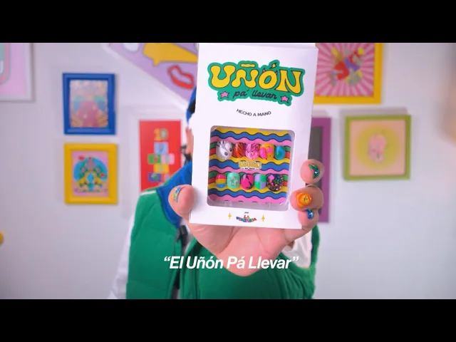
After developing the branding for La Vantasía, I was invited to create the visual identity and packaging system for Uñón Pa’ Llevar, a sub-brand focused on handmade themed press-on nails. The project included logo design, packaging structure, label systems, character design, stickers, and artwork for supporting products such as the nail remover. The goal was to build a packaging universe that could hold the diversity of the nail collections—ranging from psychotropic and techno-gothic concepts to Halloween and Christmas editions—while still feeling cohesive and unmistakably part of La Vantasía’s world.
Packaging and Visual Identity for Uñón Pa’ Llevar
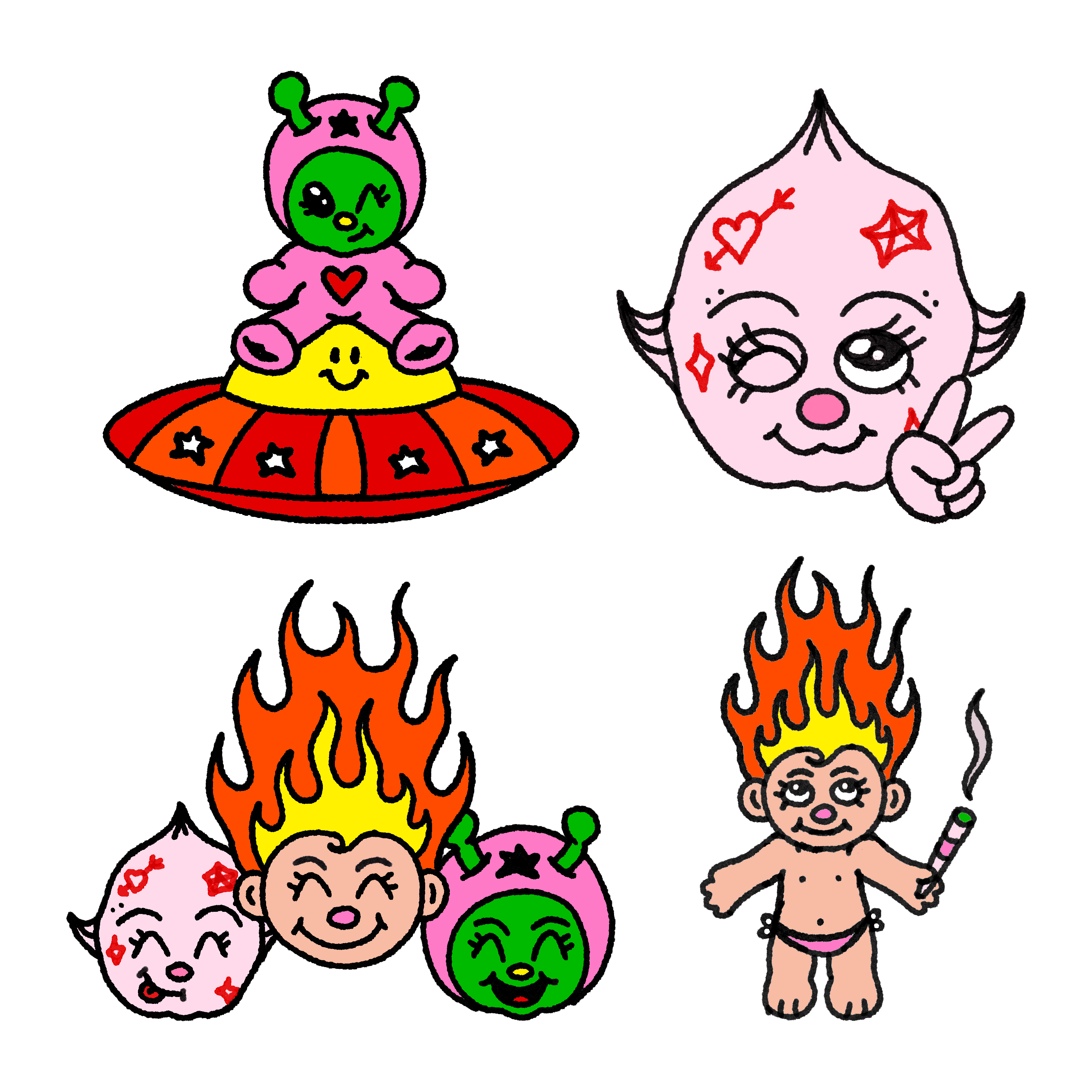
Visually, I approached the brand through a kindergarten-inspired, kidcore lens: bold blocks of color, playful contrast, and an intentionally exaggerated sense of joy. The palette draws from vibrant Mexican color sensibilities but reframes them with a more contemporary graphic language, creating something nostalgic yet fresh. Alongside the packaging, I developed a series of companion sticker characters—including a troll named Grifito, an alien, and a kewpie-inspired figure—expanding the personality of the brand beyond the product itself and giving each order a collectible, narrative quality.
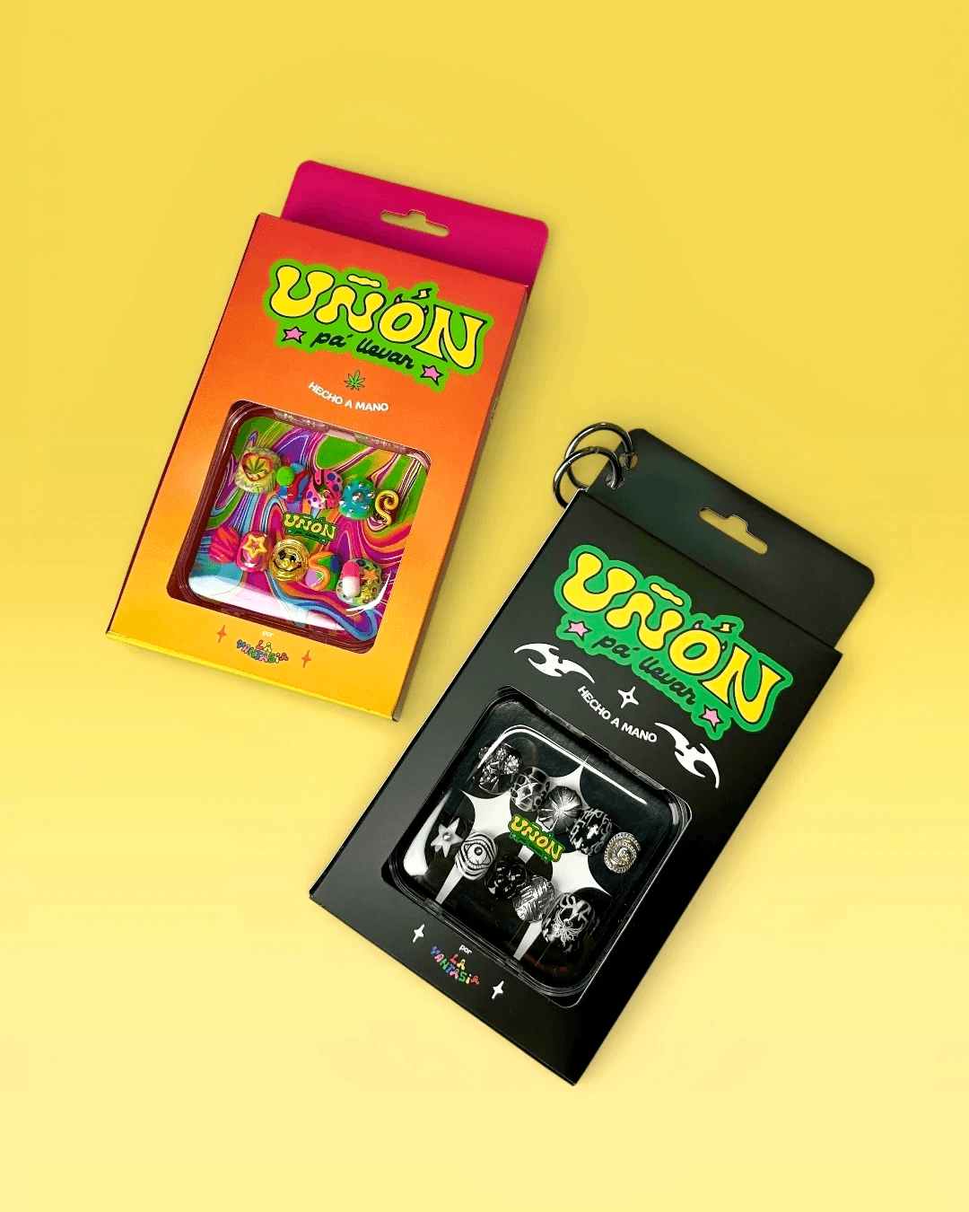
The main challenge was designing a system flexible enough to contain many different nail aesthetics without losing brand consistency. Each collection had its own strong personality—some darker and futuristic, others festive or psychedelic—so the packaging needed to adapt to multiple moods while still feeling like part of the same family. At the same time, the brand required a playful and highly visible identity that could stand out in physical market settings, where packaging needs to attract attention instantly.
Another layer of complexity was maintaining continuity with the branding universe I had already built for La Vantasía. Uñón Pa’ Llevar needed its own personality, but it also had to feel naturally connected to the original visual language. The solution had to balance individuality with recognition—creating a sub-brand that felt fresh while preserving the spirit and visual equity of the parent brand.
I developed a modular packaging identity that uses bold color relationships, playful character elements, and strong visual framing to create consistency across multiple themed releases. Instead of designing a rigid system, I created a flexible visual language where the structure remains recognizable but the mood can shift according to each nail collection. This allowed psychotropic, techno-gothic, seasonal, and experimental designs to coexist under one unified identity.
Dieline Packaging

To reinforce the playful identity of the brand, I designed a series of accompanying stickers featuring original characters from La Vantasía’s universe: Grifito, a troll-like figure, alongside an alien and a kewpie-inspired character. These elements expand the packaging beyond product containment and transform it into an experience—something collectible, expressive, and emotionally tied to the artist’s audience.
The final result is a highly recognizable packaging system that performs both visually and commercially. The project has become an important part of the brand’s presence at design fairs and markets in Mexico, supporting the continued success of La Vantasía’s handcrafted nail collections and strengthening the visual identity of the sub-brand within a growing creative community.
year
2025
timeframe
2 months
tools
Procreate, Photoshop, Illustrator
category
Branding & Packaging Design
